Seeing Estonia through Cult Jewellery: Reflections of the exhibition, Estonishing ! 13° from Estonia

To highlight the opening of Estonishing ! 13° in Tallinn that happened on the 16th of November 2016, I’m posting this text I wrote originally for SIRP magazine that was translated into Estonian. Here it is in english for the first time. The original debut of this exhibition took place at SCHMUCK 2016 in the Handwerksmesse in Munich, Germany, 24.02 – 01.03.2016

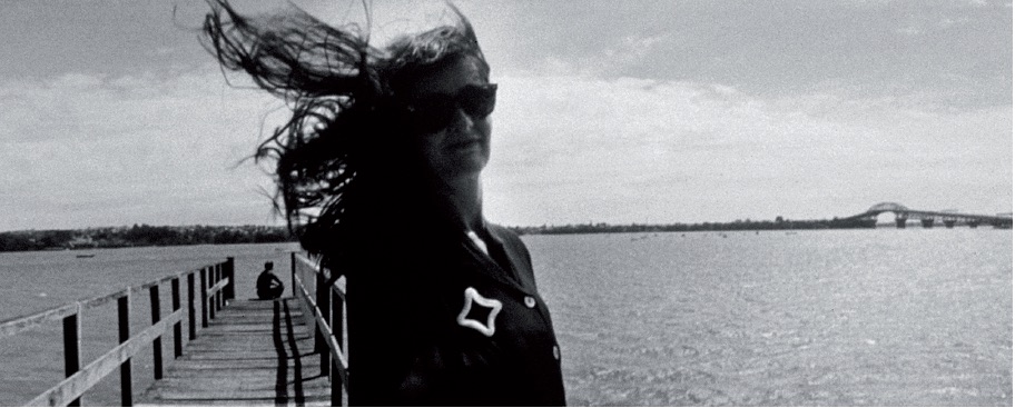
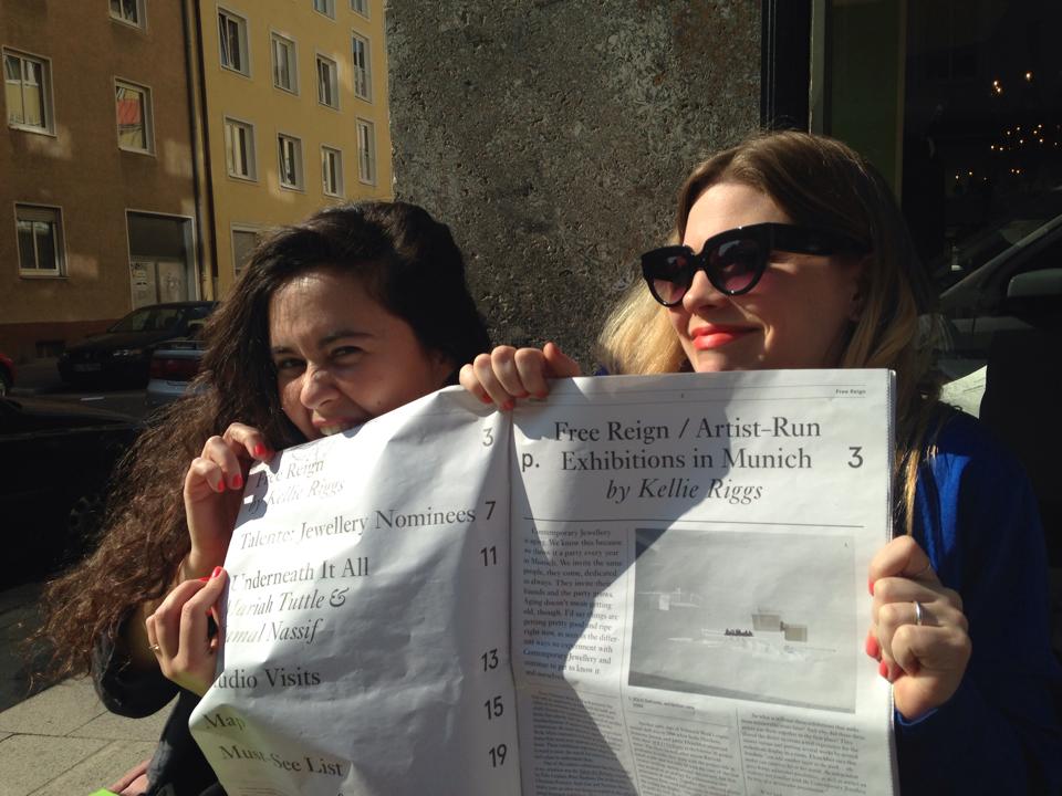
text by Kellie Riggs

OLYMPUS DIGITAL CAMERA

The Contemporary Jewellery community is not big, but it is unique. It remains to hover somewhere above other, similar creative fields like fashion, design, art and craft. Never quite assimilating, it is instead a combination of the four, taking the best aspects from each of these groups back to its own special atmosphere and turning it into something amazing. The field, its artists and community all can feel like a well-kept secret hidden in plain sight. But in fact, it spans every continent on the globe, found tucked in pockets and hubs rich with cultural relevance and a collective will to express and adorn.

It is one week a year in Munich, Germany that contemporary jewellery’s modesty steps aside and the field (both cultural and academic) is able to come together as one global community acting as a fortified front. It shows the best of itself in broad daylight. Its members flock from every corner of the world, becoming pilgrims. And the jewellery on display itself become relics, housed in specially created spaces that only Munich Jewellery Week can inspire and cultivate. It is all rather cult, as its followers – students, artists, enthusiasts, and collectors alike – have a specific kind of admiration and devotion that can be felt buzzing on the streets of Munich from exhibition to exhibition.

Over the course of the last ten years, Munich Jewellery Week (as it has only recently been known to be called, coinciding with the SCHMUCK event) has grown exponentially. Starting with around ten collateral exhibitions throughout the city in 2006, MJW 2016 boasted over seventy. Whether they are academic classes or artist-run collectives, many diverse international jewellery groups come to show what they do via independent or gallery represented exhibitions. And when done right, they are able to demonstrate particular cultural tendencies in jewellery at large, and illustrate more sensitive cultural perspectives through the particular expressiveness that jewellery provides. Good Contemporary Jewellery is always a lens through which to look into the subtleties of other cultures, national or local, big or small. It is an irreplaceable means to understand how different cultures or subcultures feel about certain elusive subjects – many of which are quite intimate – as jewellery is a relatively intimate affair to begin with.

So what does it mean for jewellery to be from a certain place? From Estonia? What kind of illustration does the world have of this country through the jewellery that comes out of it? I myself can only speak to an outsider’s perspective and reflect on the impression that’s been made in places like Munich where Estonian artists have been able to show face together against the backdrop of a contrasting cultural framework. In one way or another they act as a collective ambassador, providing one of the few and probably most profound windows through which one can catch a glimpse of this fascinating (and largely mysterious) land. In all actuality, Estonia and Estonian Contemporary Jewellery remain the subject of intrigue in the international Contemporary Jewellery community; there seems to be a special kind of force field that surrounds it, one that recalls magic and evokes a curious kind of arousal.

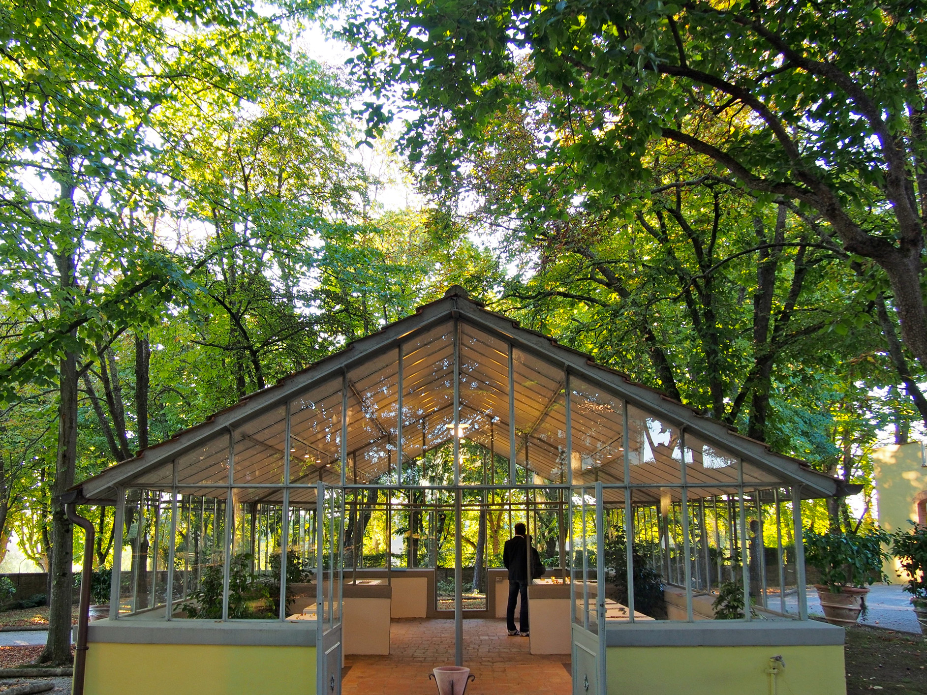
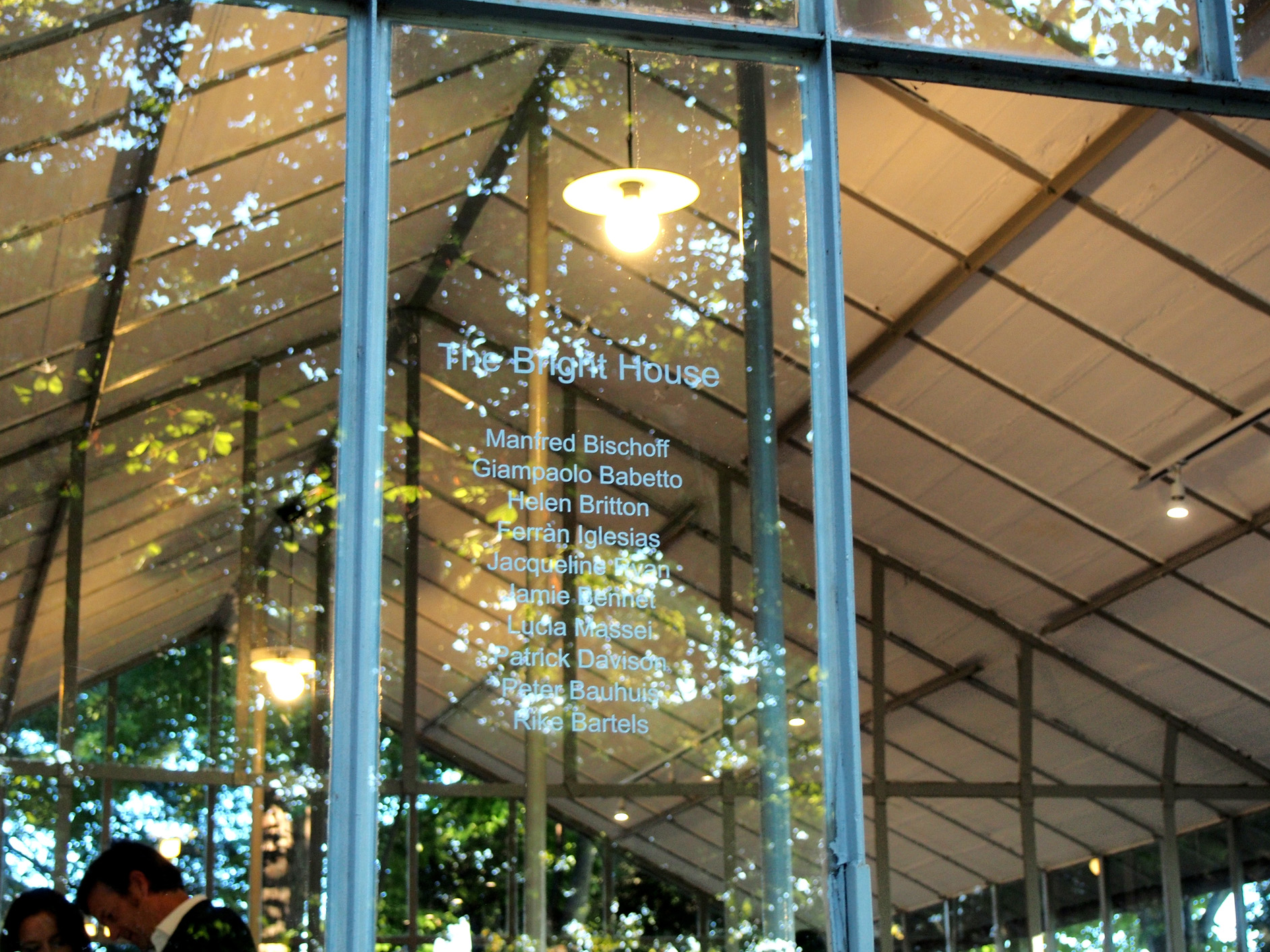
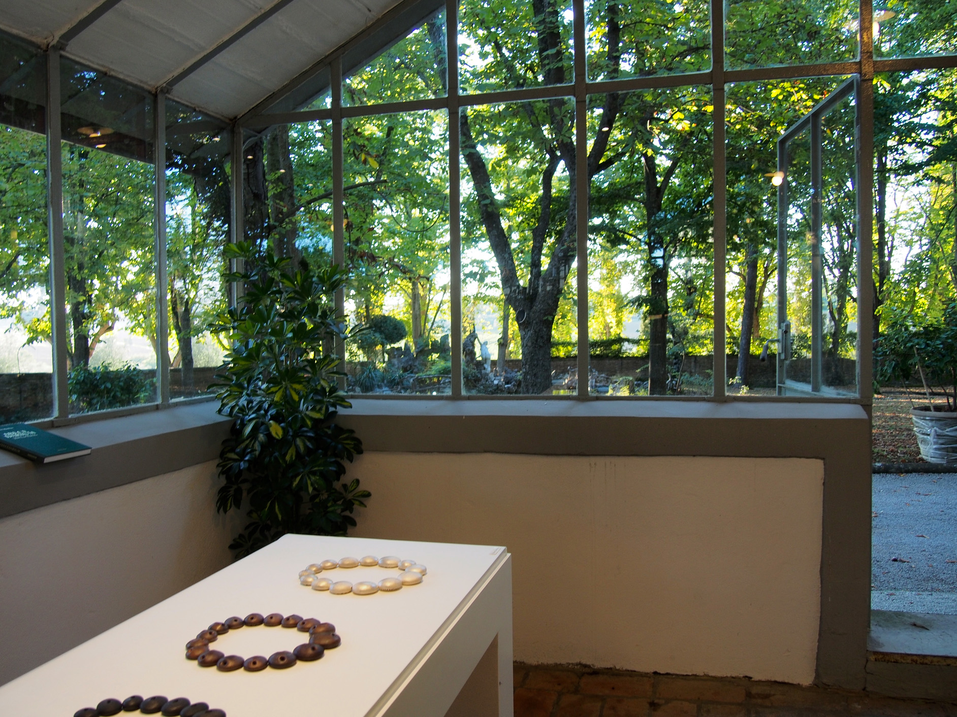
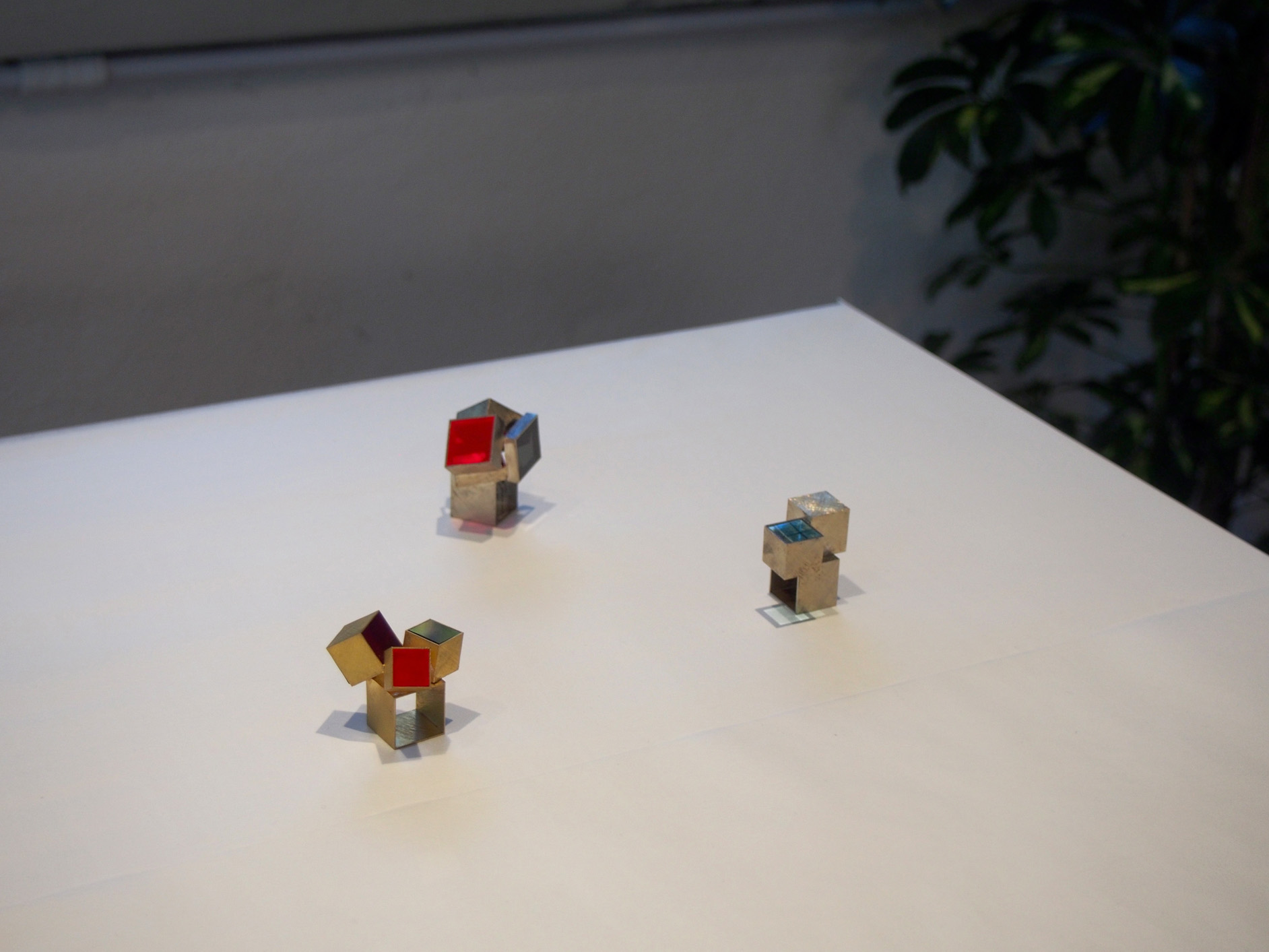
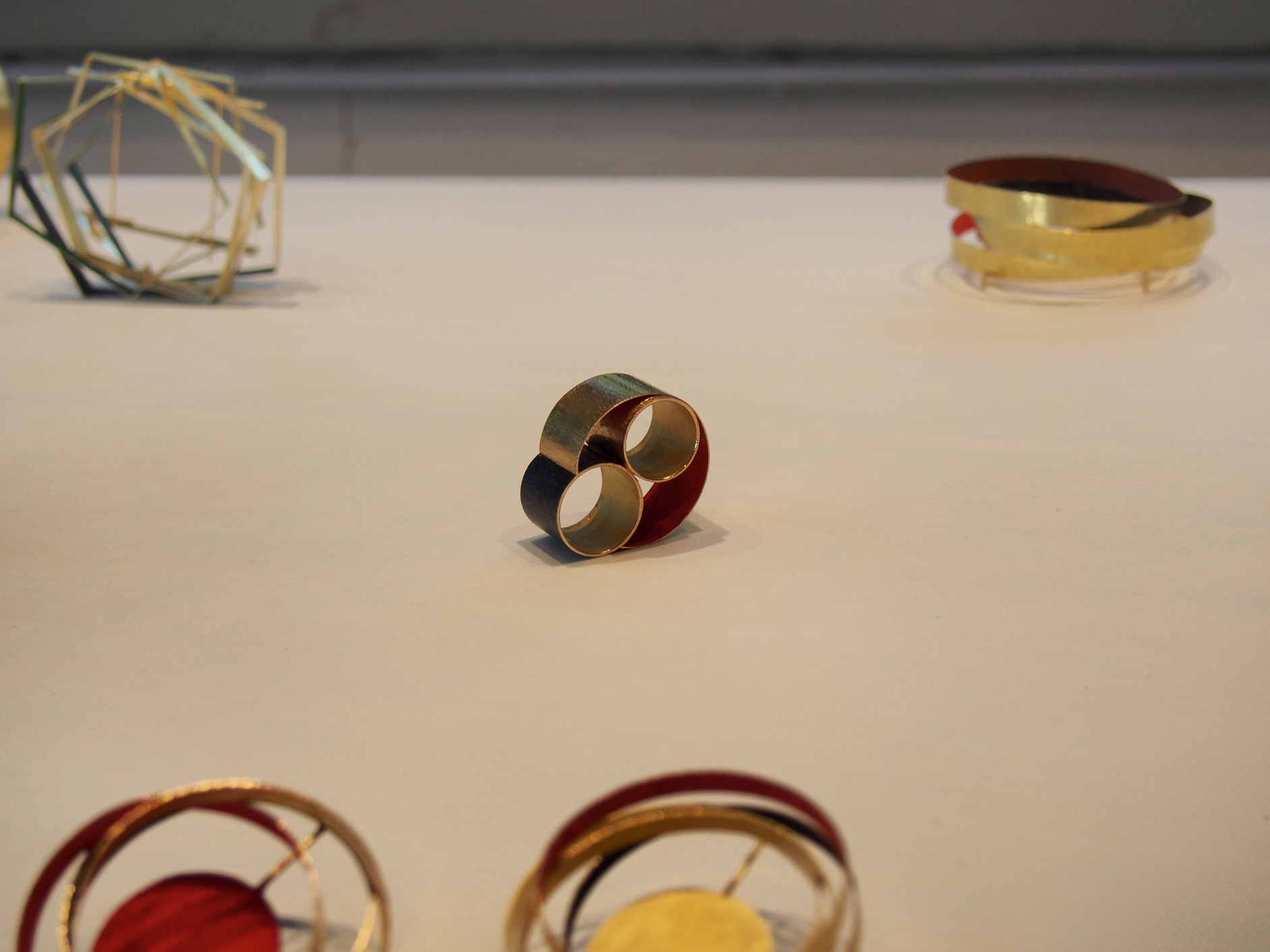
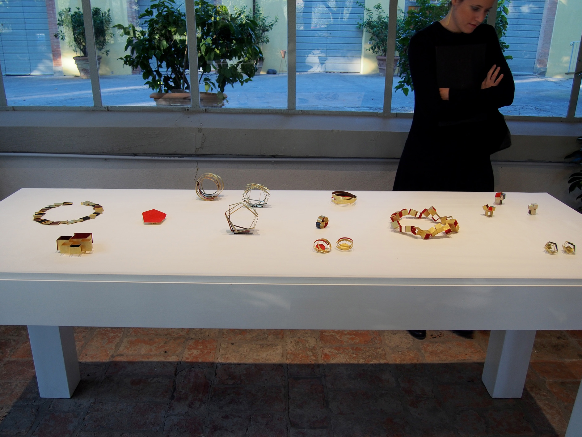
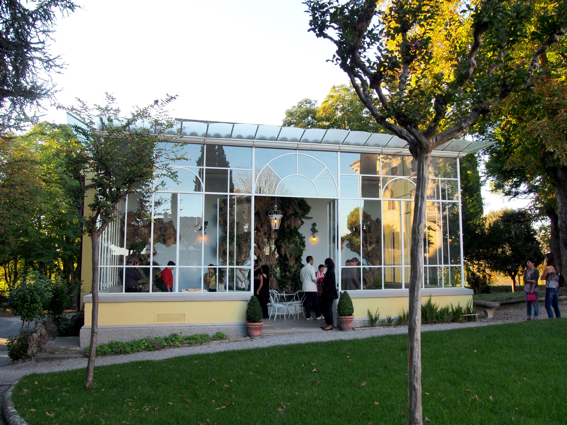
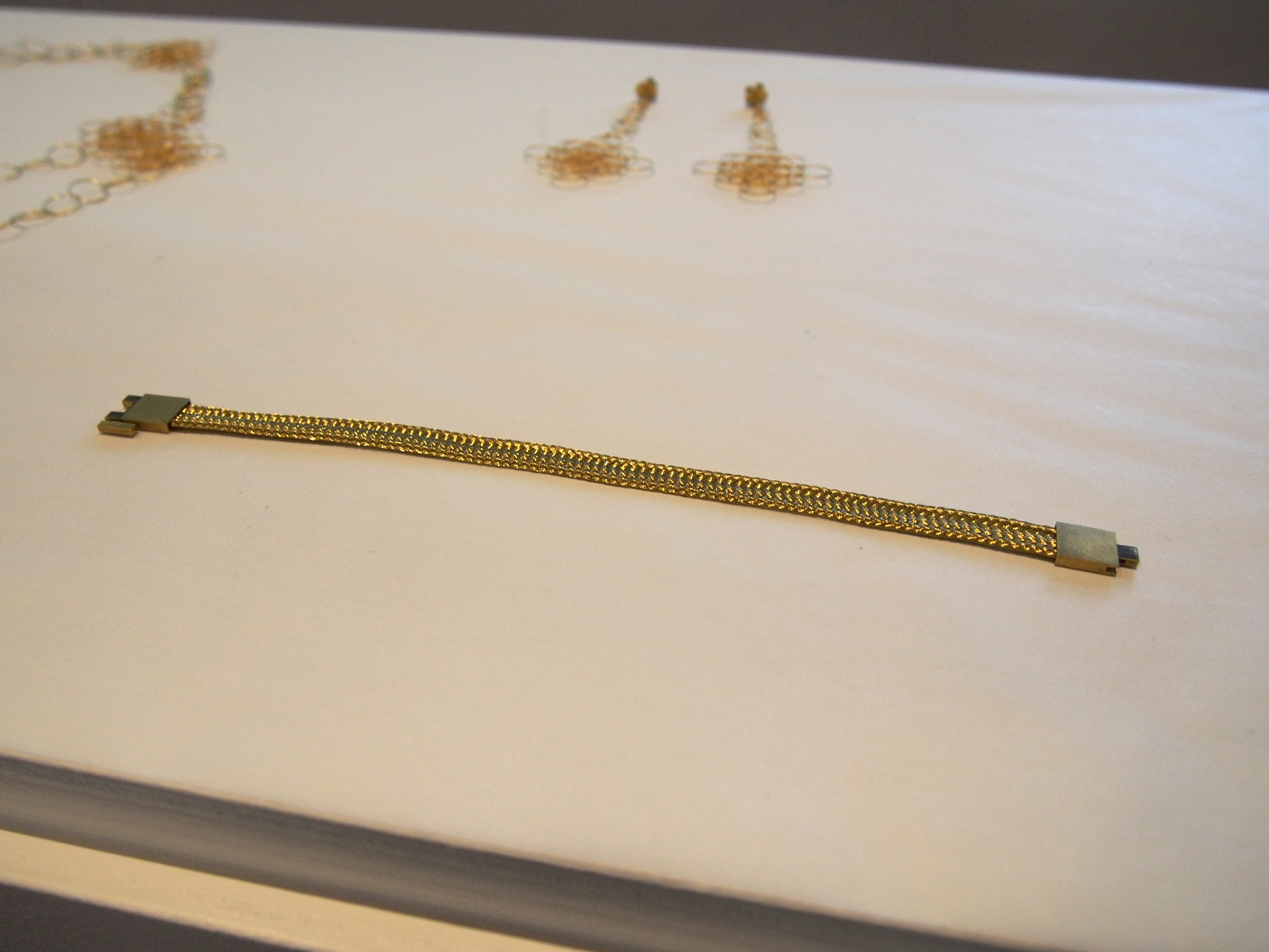
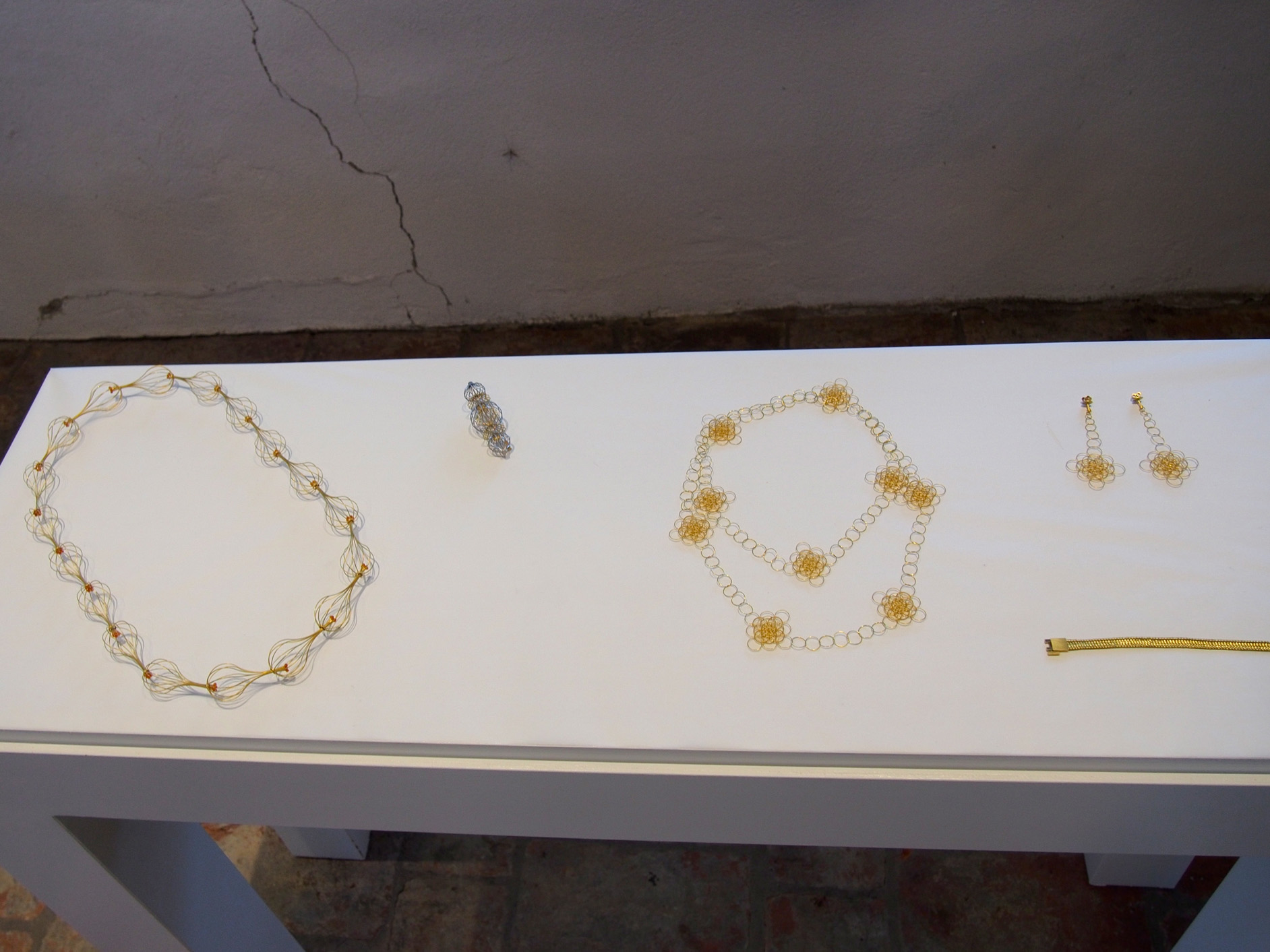
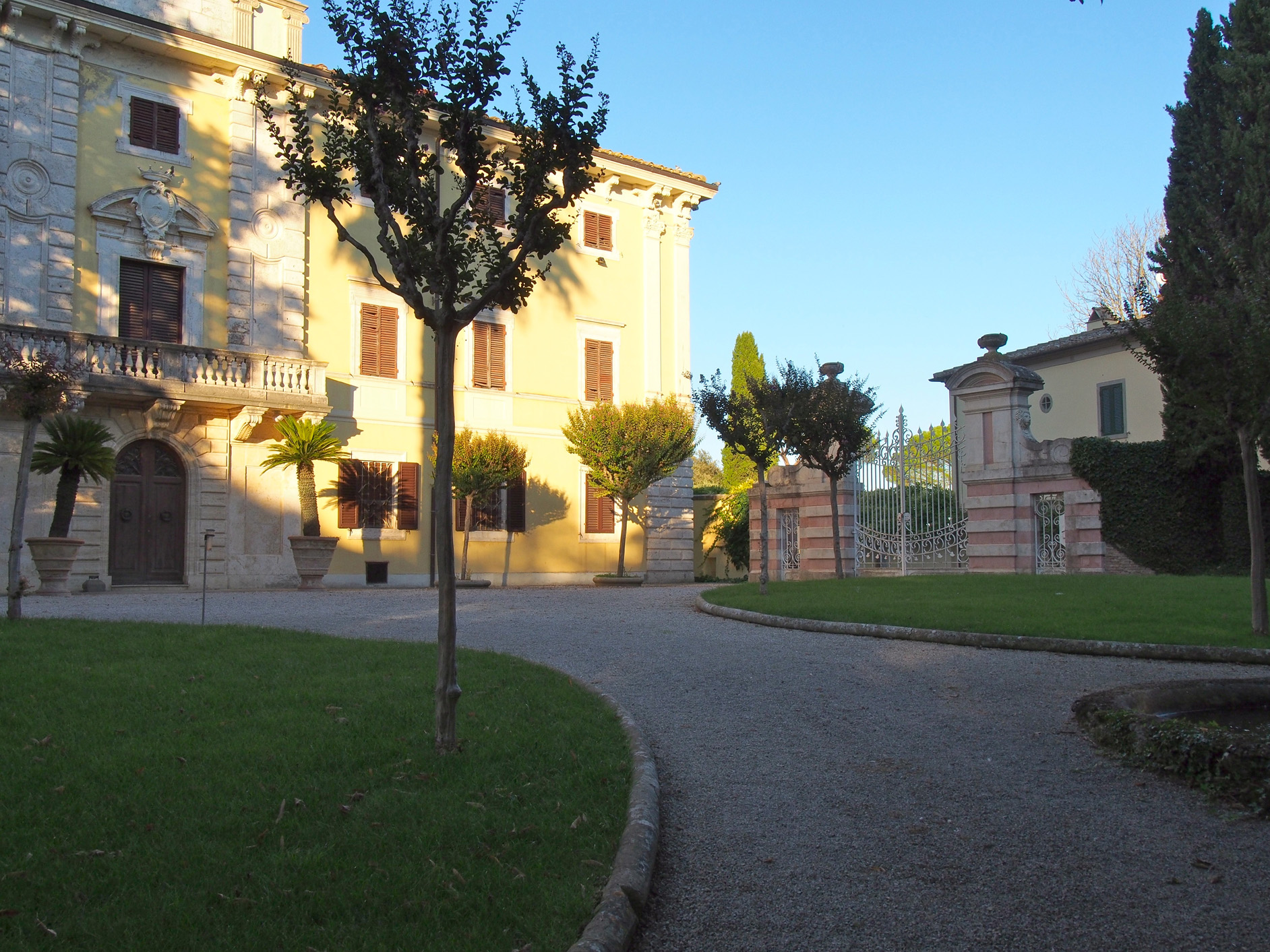
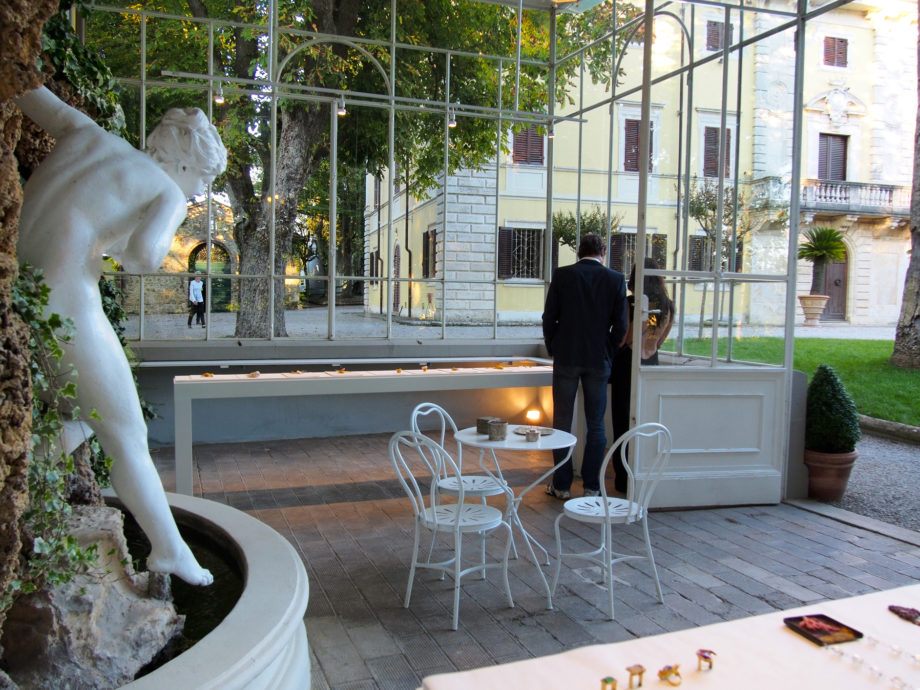
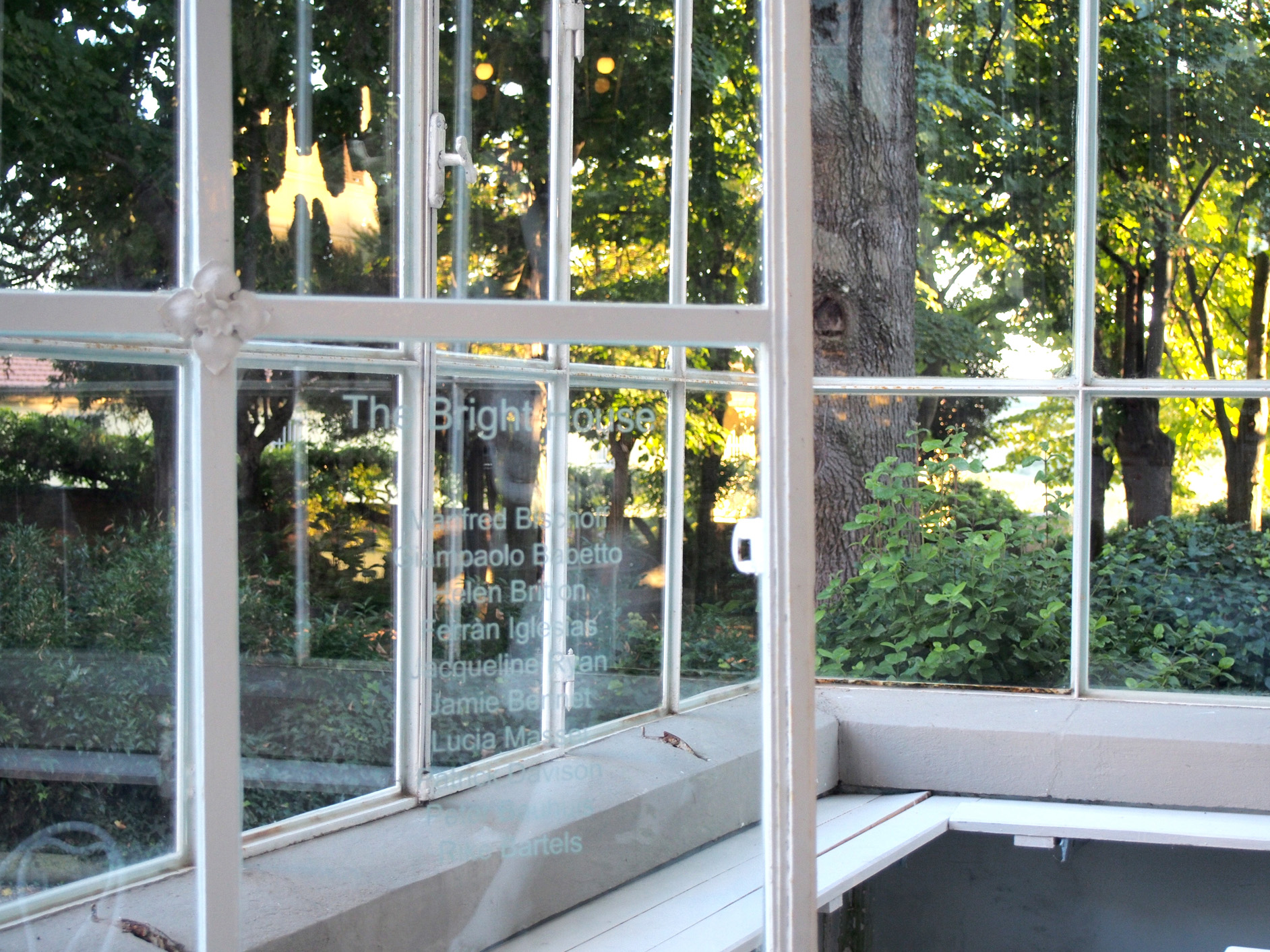
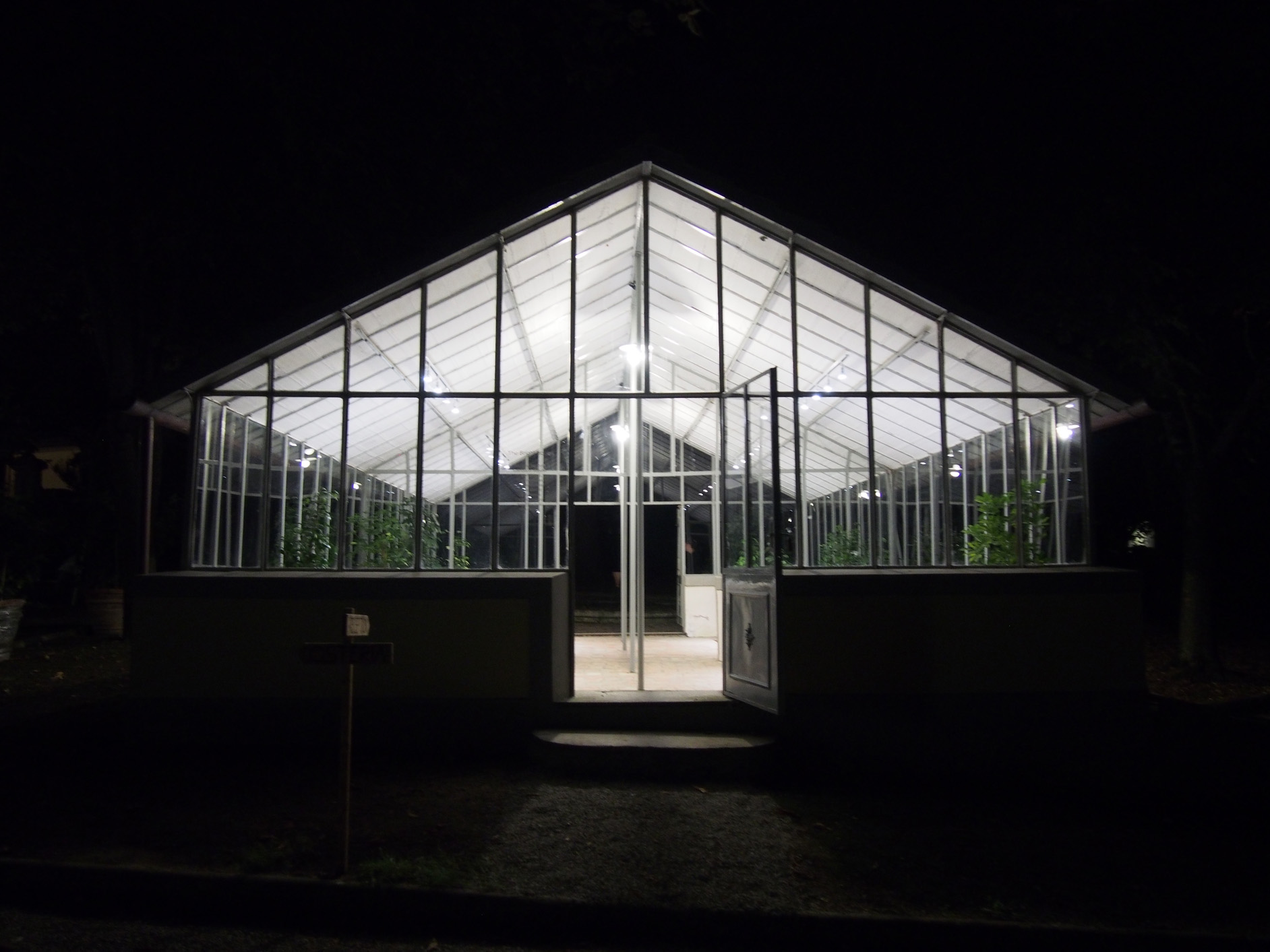
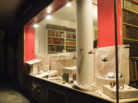
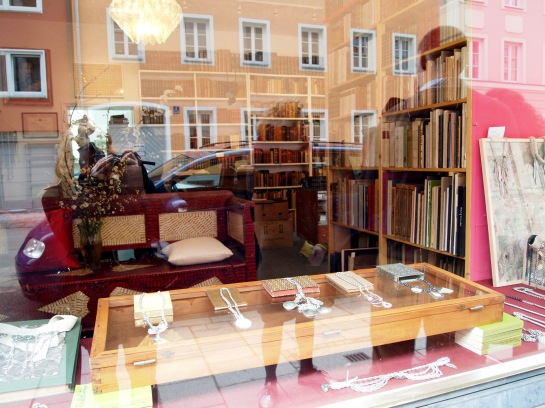
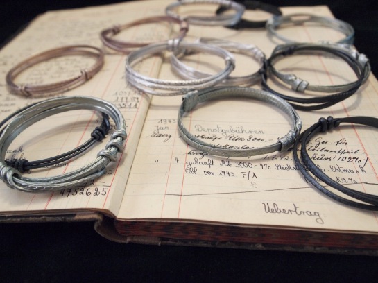
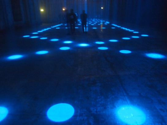
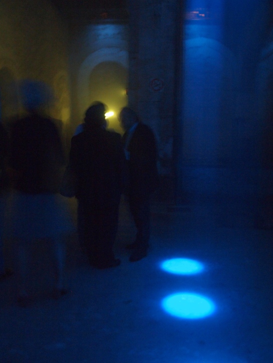
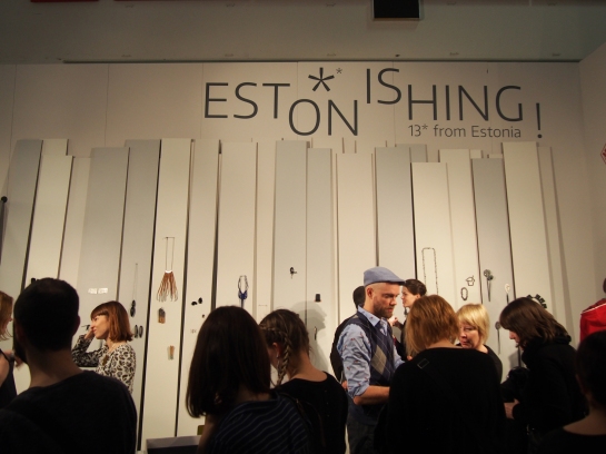
This year in Munich, Estonian jewellery artists could be found in many places. The work of Nils Hint, more blacksmith than jeweler, was included in one of the highest quality international exhibitions in the city, (IM)PRINT. Three of the more internationally prolific artists were selected for the prestigious juried SCHMUCK exhibition that takes place every year in the Handwerksmesse Exhibition Hall: Kadri Mälk, Tanel Veenre, and Linda Al-Assi. And Darja Popolitova, who just recently graduated from the Estonian Academy of Arts, was selected for the congruent TALENTE exhibition. But somewhere within the maze of uninspired booths of international jewellery galleries that surrounded these shows, the real gem could be found: the exhibition, “ESTONISHING !”, presented by Thomas Cohn Gallery, co-curated by the gallerist himself, and artist, Tanel Veenre. The magnetism of the work of this group of Estonian artists was so strong that it could be felt in São Paulo, Brazil (where Mr. Cohn is located), and convincing enough to come together for exhibition in Munich. As far as I know, it was also Mr. Cohn’s first year presenting the gallery at the Handwerksmesse, which is a big deal.

That right there is magic. Some kind of supernatural connection brought these seemingly disparate people together. And speaking of connection, what is it that connects these thirteen Estonian artists to one another? I find this question to be often reoccurring, as there is some kind of pull, something very grounded, something only sensed but invisible, that ties Estonian work together in a way that is so unique, it is simply not found in other Contemporary Jewellry circles in other countries. They appear spiritually united, and at this point in the history of Contemporary Jewellery, this is now universally recognized. But how?

This very question of connection was precisely what Veenre sought to examine when organizing the exhibition. He asked: Is it patience, an endeavour for holiness, assurance, or hope that connects us? Is is melancholy? These questions are perhaps not meant to be solved, rendering a smart and lyrical way to ask the viewer to really look into the jewellery on display and investigate their vulnerability and universality.

This is an intriguing question, and quite a responsible line of inquiry considering whom it’s coming from. Throughout the years, Veenre has not only unofficially been the spokesperson for Estonian Jewellery as a whole by giving a face and a voice to this special sect of the jewellery field to international eyes and ears – but he is also one of the few brave artists in general leading the way for change and new relevancy for the field of Contemporary Jewellery as a whole, by more closely associating it to other art and cultural genres. And as such, the Estonian team has followed with a reputation of taking itself seriously (having high quality exhibitions, publications, and have created a solid identity) while working with and enjoying a special sense of fantasy, mysticism and poetry that is always captivating and uniquely their own.

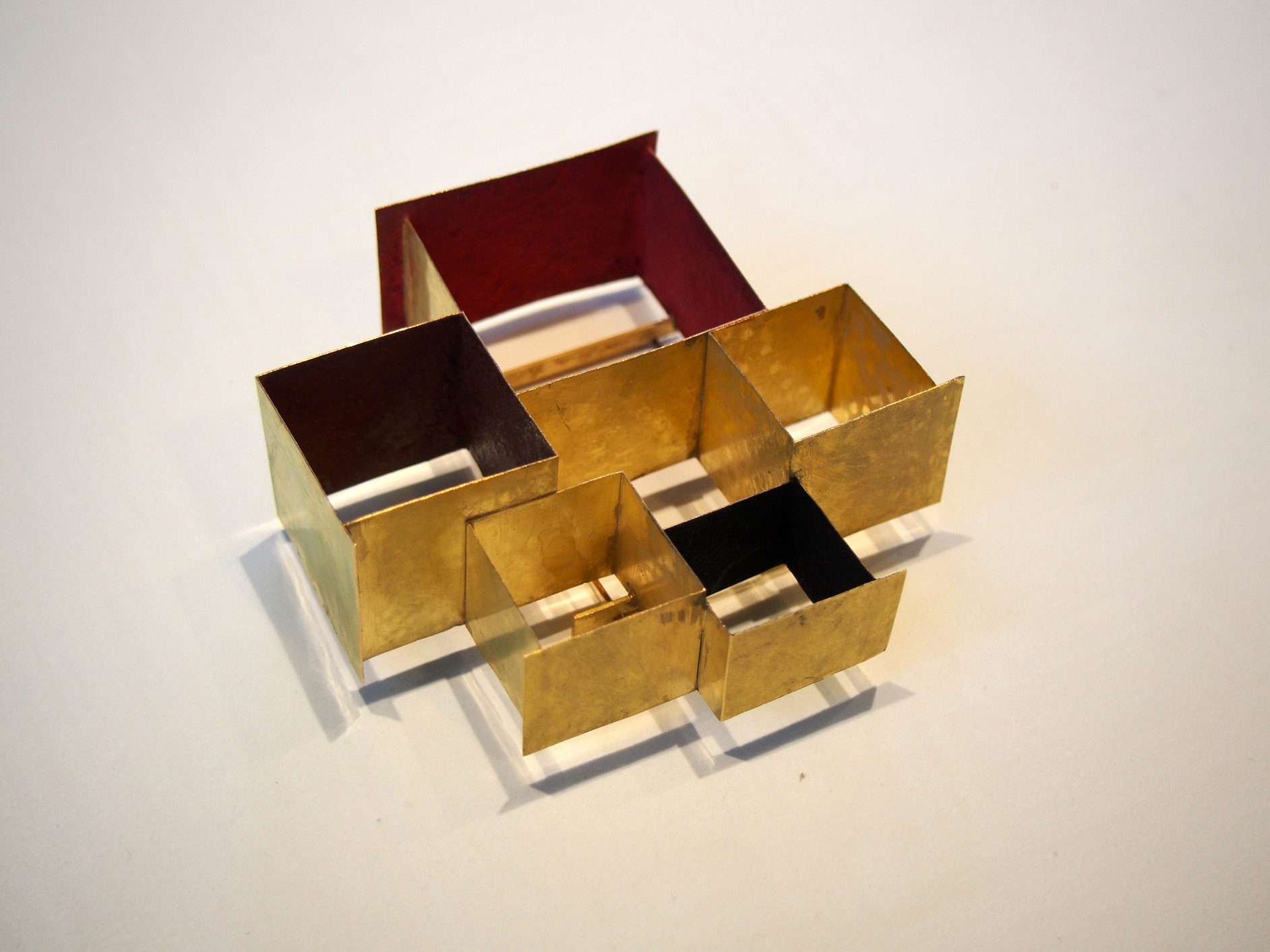
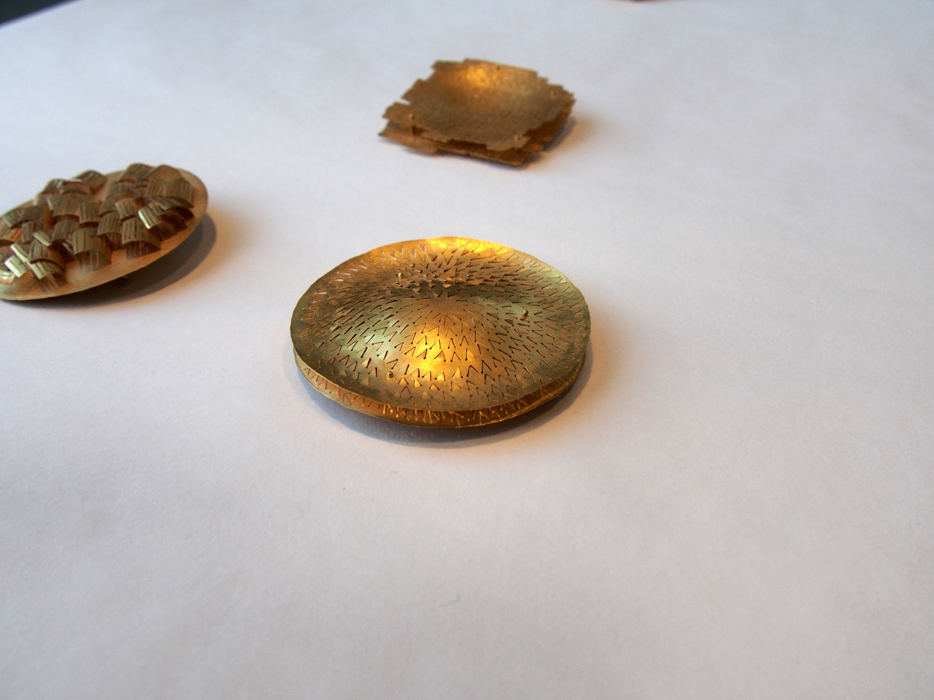
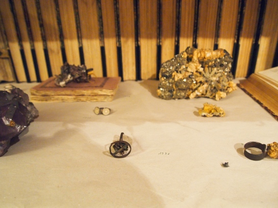
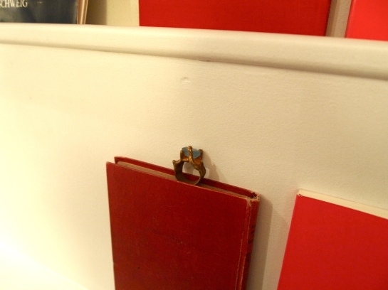
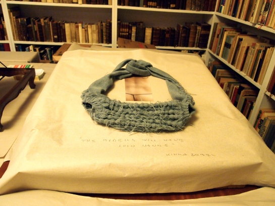
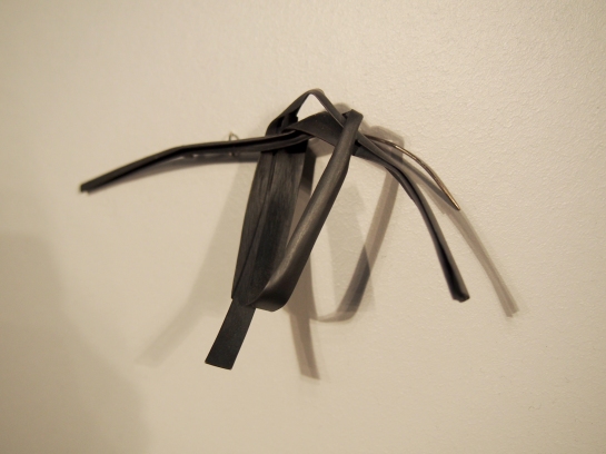
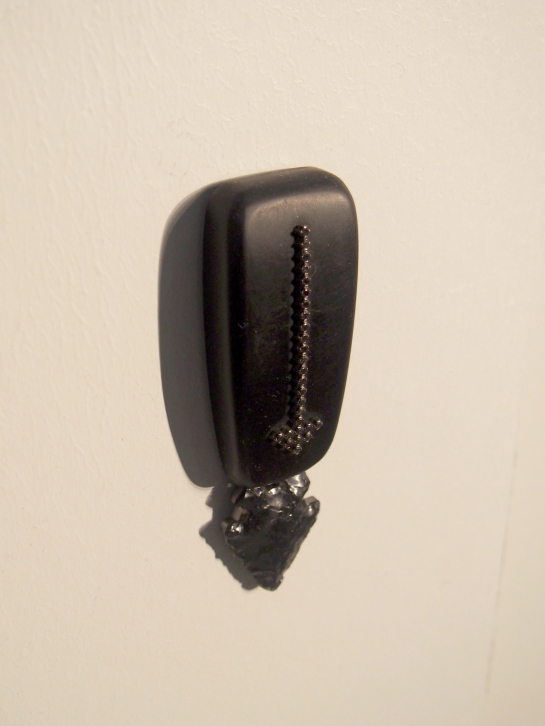
Some of the more intriguing and relevant work included in ESTONISHING ! came from Nils Hint, a younger face in the field that is getting noticed on an international level more and more steadily for his flattened iron work. He takes ready-made tools like wrenches from the scrap yard to join and then flatten using a power hammer and other blacksmithing techniques. The more striking pieces in this exhibition however were those more three-dimensional, utilizing iron elements as means to draw. Purposefully phallic or cross-like objects (like his Mahine1 (Manful) brooch, forged iron, 2015) were created to imply a “childish or primitive kind of street art, like dicks drawn on the wall,” says the artist.

Alternatively, Ketli Tiitsar and her Teine Olemus (Second Nature) brooches and necklace, made from ash wood, silver, pigment (2016) added a more internal sensibility to the show. The pieces, visually delicate and alive speak about Tiitsar’s personal memory utilizing materials from places that she knows, in an intimate manner of speaking. The wood recalls her family’s tradition of cutting firewood to heat their home, and in a sense she carries on with that repetitive tradition through her practice while paying respect to it at the same time. They are also very hip and modern pieces which is an excellent juxtaposition to the sentimentality involved.

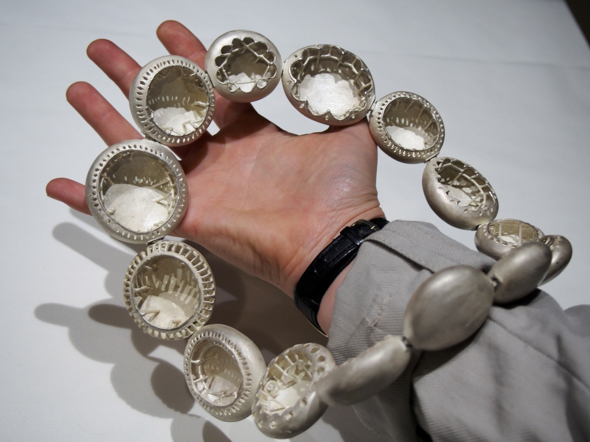
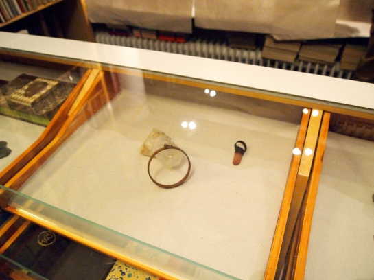
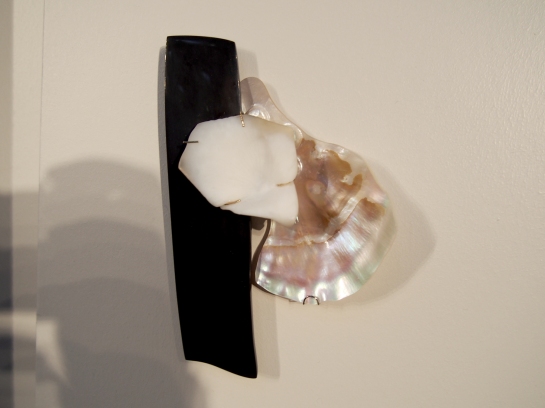
Maarja Niinemägi’s simple and elegant engraved stone brooches, Ööparved (Night Floats), are also noteworthy for their pure and natural qualities. Essentially collages made from milky opal, buffalo horn, mother of pearl, silver and gold (2013), they are made to inspire a sense of grouping and collective metaphorical floating.

Although just three examples here, from the outside, it looks as though it must also be nature that connects most of these Estonian jewellery artists. What runs true and deep in someone sometimes goes personally unnoticed or unsaid because it is so much a part of them; their bond to nature didn’t need to be verbalized to be felt.

And what about the connection made by their fearless leader, Kadri Mälk? Veenre poses this question as well, as all the artists are alumni of the Estonian Academy of Arts from the jewellery and Blacksmithing department, twelve of the thirteen being Mälk’s former students. The veneration of this woman, who has been a professor at EAA for a long long while, reverberates far beyond the confines of Estonia and is inextricable from the work of any of her alumni no matter how far it travels. Needless to say Mälk herself was also a part of this exhibition, her dark pieces swirling with qualities of secrecy and fascination seem to provide us a window into her soul. This characteristic, rarely found to be so strong in Contemporary Jewellery, illicits a feeling of witchcraft and seduction, further breathing life into the cult-like nature Estonian Contemporary Jewellery possesses. It is safe to say that today’s Estonian jewellers are their own leg of the jewellery cult (Cult Jewellery, let’s go on to call it), and they have the world’s attention.
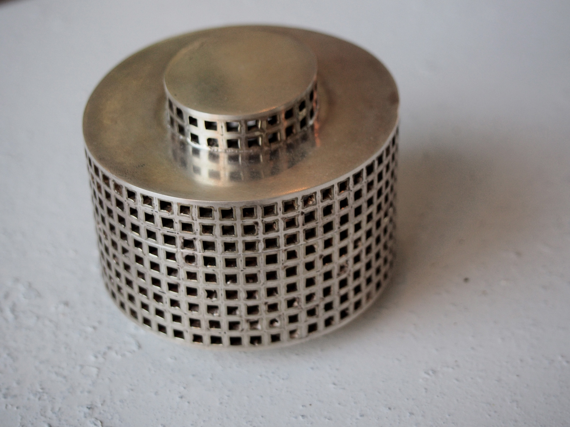
OLYMPUS DIGITAL CAMERA

Nils Hint

OLYMPUS DIGITAL CAMERA

Maarja Niinemägi

OLYMPUS DIGITAL CAMERAOLYMPUS DIGITAL CAMERA

OLYMPUS DIGITAL CAMERA

Ketli Tiitsar

OLYMPUS DIGITAL CAMERAOLYMPUS DIGITAL CAMERA


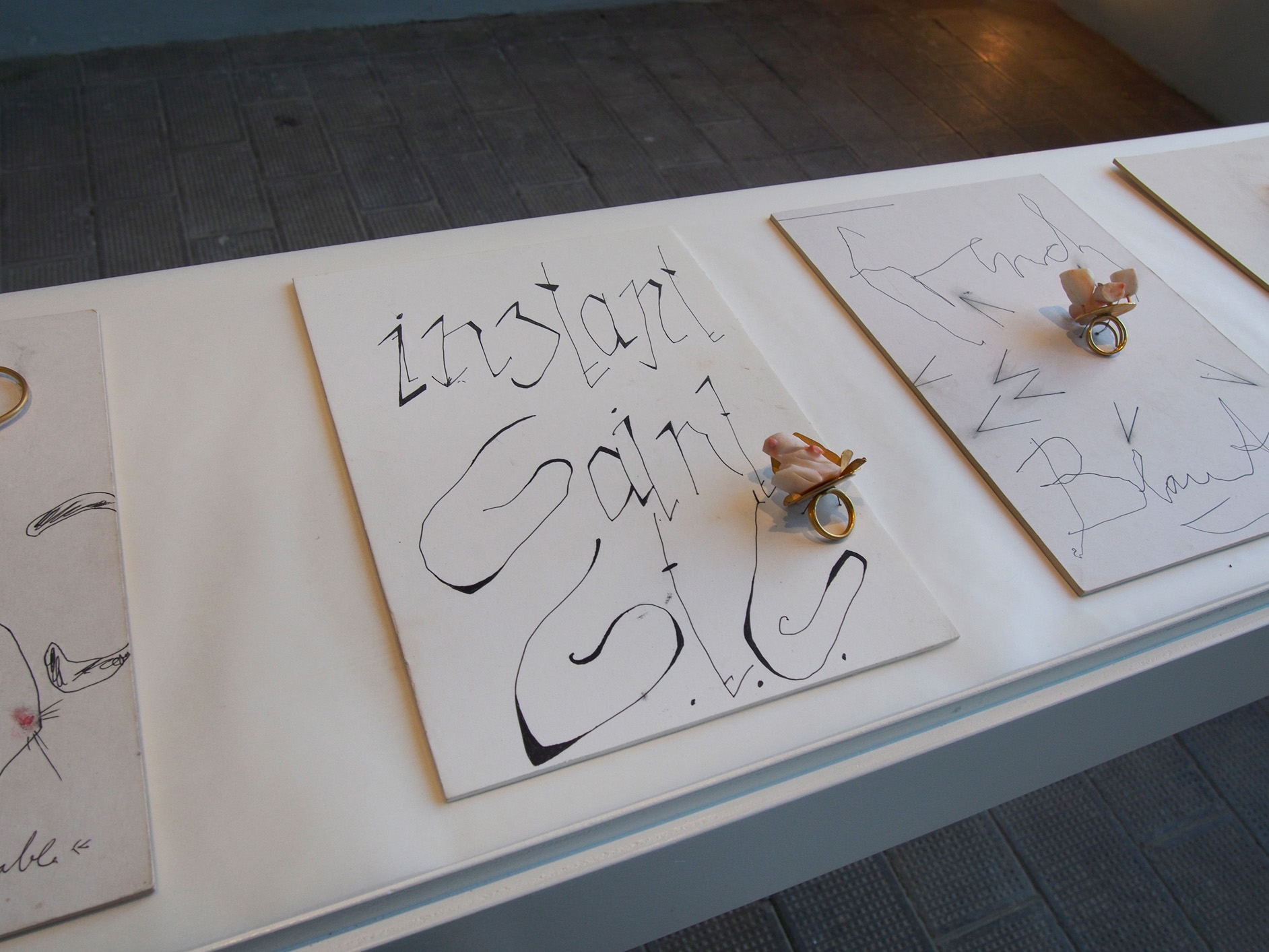
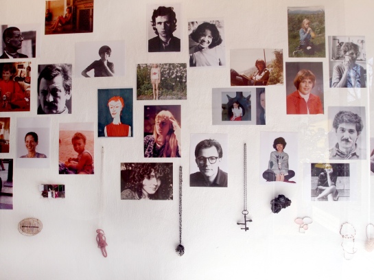
The exhibition is accompanied by a catalogue designed by Asko and Julia Maria Künnap. In addition to presenting the work, each artist reveals something about themselves through one Estonian word and an illustrative image.

Curators: Thomas Cohn and Tanel Veenre

Participating artists:
Kadri Mälk, Tanel Veenre, Piret Hirv, Kristiina Laurits, Villu Plink, Nils Hint, Sofja Hallik, Eve Margus-Villems, Darja Popolitova, Maria Valdma, Julia Maria Künnap, Maarja Niinemägi, Ketli Tiitsar

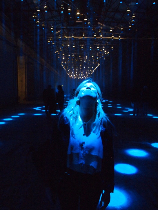
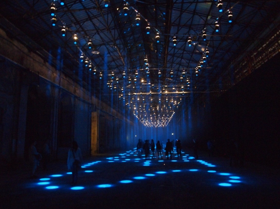
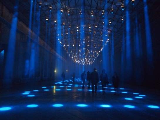
The design of the exhibition is a collaboration by all the participating artists.

Supporters: Thomas Cohn, Cultural Endowment of Estonia, Susan Cummins, Helena Pahlman, Mart Kalm, Law Office Ehasoo&Partners, SA Noor Ehe, Emil Urbel

“I am still an autonomous artist but I don’t make autonomous objects. During the making I have thought past the moment in the display case or in the gallery where it comfortably leans on its friends. I, of course, can imagine it being worn by its owner but I can also imagine the moment where it is cast into the bottom of a handbag, lost on a footpath, found and resold on a market stall. I can distinguish it, not as an autonomous object enjoying the loving context of the gallery, but out in the world answering all sorts of difficult questions about what it is.”

-Warwick Freeman

soft star 1991

Excerpt from the seminar, Reconsidering Identity

Röhsska Museum, Göteborg

September 19 2009

Dear People, 

As you may have noticed, not much gets posted here anymore. It’s regrettable, but I since I’ve become a fellow at RISD’s European Honors Program (a two year stint, ending soon) I’ve been traveling and traveling and quite busy here in Rome, plus more and more frequently I get asked to write elsewhere. As such, I thought I should tell you where to find my writing elsewhere, freelance mostly for various online and physical publications:

Current Obsession – I’ve been working more and more intensely with the amazing people at CO since their first published magazine, The Archetype Issue, where I have two interviews with Karl Fritsch and Alexander Blank. I also wrote a much bigger text and quasi manifesto called, Bling is Ok!, featured in the third Issue, Fake (copies still available!). We have also published two paper versions of the magazine that coincided with Munich Jewelry Week (you can find them here and here, the second has an interview with Hanna Hedman and an article about crystals and the supernatural). Currently i’m proud to say that I am an editor for the magazine with many big projects to come… keep your eyes peeled !

Art Jewelry Forum – For the last few years i’ve been doing many gallery interviews (like this one with Sofia Björkman of Platina); Best Of features for Munich Jewelry Week/Schmuck; and various texts like this one about exhibition strategies which was recently republished in a book, Shows and Tales, just out now! There you’ll also find a brand new interview between me and Ruudt Peters, never before published.

Thanks to those of you who still read this blog! Check the facebook page for a bit more presence on my part, and if you really appreciate the content of this blog, please kindly consider a small donation making it easier for me to produce new content (on the topbar above you’ll find the link:))

Jewelry love to all,

Kellie Riggs

Marina and myself holding 2014's paper for Munich Jewelry Week

The Current Obsession Team!

Feature in most recent CO Paper, Supernatural

SaT-for-Kellie

The Bright House

Saturday September 27, Camucia – Cortona, Italy / location: Tenimenti Luigi d’Alessandro Winery

The Bright House, a review

by Kellie Riggs

I used to talk frequently of the dream show; I never knew what it was exactly or what it looked like, but the idea was basically to imagine a space where jewelry could truly be itself, speaking for itself without too much help. The work would be together yet independent, emboldened by its company and especially by its surroundings, surroundings much different than your average jewelry exhibition, someplace more inviting. But what kind of new space would it have to be, to give each individual piece its own privacy so to speak, it’s own fortified spotlight beyond the pretense of what we are used to seeing in an installation?

The word dream implies beyond reality, the ideal, exaltation even, and that’s exactly what The Bright House was – a 48 hour ultimate jewelry fantasy if you will – if as though contemporary jewelry threw itself an exclusive, budget-less birthday party with the highest consideration of taste, beauty and even restraint. But what else would one expect when the background for the show is the grounds of a spacious and immaculate Tuscan Villa, with the colors and winds of nature sweeping through the air like magic? There were no white walls to be found here, just glass as though the surrounding structures to the jewelry were nothing more than an illusion, almost an invisible stage for the jewels on display. No cases, no security, an open invitation to touch, to try, and the opportunity for dialogue as many of the artists were also present. A feeling of safety and calmness was in circulation, a true haven of delicacies, many of which were gold.

The show was defined by two groupings of work in two locations of display, both a glass house separated by a beautiful foot path that seemed to encourage a reflectiveness of the experience. As the groomed nature infiltrated the exhibition space through the windows the textural components of each body of work was rightfully amplified; even Helen Britton’s industrial-esque work began to really belong to the environment, the movement of her cuffs became leaflike, the colors echoing the fallen foliage in the grass just yards away and the sounds they make during interaction would perhaps compliment walking in the grass through the signs of the approaching fall. Across the space was another compliment to the show’s surroundings, but this time more to the light through the trees and the changing hues of green, like in the work of Jamie Bennet, paired nicely with Peter Bauhius who presented three natural pebble-like necklaces.

Across the room was a Smörgåsbord of geometric golden treats all of which were characteristically Babetto, the most exciting piece being a quite impressively flexible and reversible square component necklace defying physical odds when handled. Anytime I see Babetto’s work I know i’m in the right place.. he brings a sense of ease to the room somehow, as by seeing him you know the rest of the work from other artists has got to be worth something. Giampaolo Babetto is my first jewelry hero and seeing new iterations of himself, which his work always seems to be, is exciting for me in all of its variations and subtleties; take for example the use of a rustic, rusty red pigment seen in his new work.

Up the footpath and into the next glass house of which the back wall features a bit of the outside world. Giant rocks climbing up the walls frame a mirrored fountain and in its vicinity more treasures are to be found. To the right Manfred Bischoff has a row of his sculptural and almost cryptically narrative gold work which are always an impressive sight, opposite that of Jacqueline Ryan whose more intimate and textural work dazzles. Ryan’s presence reintroduces the show’s connection with the surrounding nature through surface quality and moments of movement. She also forms a somewhat unexpected association to Patrick Davison’s non jewelry work (found in the same room) through shared pattern and geometry. Davison, whose pieces are the only of its kind in the exhibition, is also by far the youngest artist present, proving his work to be even more impressive than a first glance will lead on.

Something I found delightful about this exhibition is that many of the artists echo one another in sometimes indistinct yet fun ways. Rike Bartels (shown in the first glass house) to Bischoff though is perhaps too obvious an example, obvious to the the point that Bartels becomes a bit amiss once Bischoff is discovered. Alternatively, Ryan’s work is the glue of the whole exhibition noted in the way she positively brings the two spaces together, well balancing both Babetto and Britton’s work through kinetics and form, and recollecting Ferràn Iglesias’ extremely delicate, patient and passionate gold wire work from the previous room.

The Bright House is much much greater than the sum of its parts. There is no question here whether the work is good or of the highest quality, yet I will note that this particular group is surely not the most relevant or contemporary of groups in the scene at large today. In a field that seems to get fresher and fresher every year, choosing such traditionalists could have posed a problem. But on the contrary, some of the artists here are introspective legends and masters of material and they deserve the space for uninterrupted tactile and even spiritual reflection that this exhibition successfully provided… all very much dream-like to say the least.

The Bright House

The Bright House

The Bright House, location

Helen Britton

Jamie Bennet

 Peter Bauhuis

Peter Bauhius

Giampaolo Babetto Giampaolo Babetto Giampaolo Babetto Giampaolo Babetto Giampaolo Babetto

The Bright House

Manfred Bischoff

Jacqueline Ryan

Jacqueline Ryan Patrick Davison   Patrick Davison

Rike Bartels

Manfred Bischoff

Jacqueline Ryan

Ferràn Iglesias

Ferràn Iglesias

The Bright House, location

The Bright House , Lucia Massei foreground

Patrick Davison and work

Patrick Davison talking with Jacqueline Ryan about his work

Antonella Villanova (left), with Giampaolo Babetto necklace

Patrick Davison (left)  with Giampaolo Babetto necklace and artist (right)

The Bright House

The Bright House

     a 20 second manifesto for the contemporary jeweler / artist : 


go outside and look around

harness and transmit your youth

remember to have fun

keep going

make dope ass shit

change does not mean death; don’t fall for the eulogy talk

bling is ok

fuck the manifesto


( WHAT CONTEMPORARY JEWELRY IS NOT )

Dear International New York Times,

Today I saw your A Cut Above Jewelry feature (from the Dec. 9 issue) laying on the table and decided to give you a read. I must say, you’re soooo confusing! I just can’t figure out why you’re using terms like, contemporary jewelry, or, conceptual and expressive, alongside luxury goods encrusted with diamonds and ridiculous gemstones that no one can afford from labels such as Graff. Is it that you accidentally misplaced the caption, “Straddling the frontier between craft and art, contemporary jewelry is not always pretty. Conceptual and expressive, its meaning may count more”? Or is it just a misguided opinion that you think this kind of stuff IS conceptual and expressive, you know, stuff that is absurdly expensive or can rarely even see in person/get any hands on? Do you think this stuff is conceptual and expressive just because it isn’t exactly normal jewelry or even young? Don’t you know there are things in this world that are really actually what you describe in that caption? I mean, you’re a newspaper, right? Aren’t you supposed to be more accurate? Wouldn’t you think you’d be more interested in things that touch on real topics, perhaps highlighting jewelry that actually is conceptual and expressive, birthed from meaningful ideas and more accessible to the average person? You know, stuff that isn’t just a crazy fantasy off limits to most your readers? Or actually just a product in the end? After all, it says in Suzy Menkes’ article, Graff has over 40 stores all over the world.

kelliepaper006

And then we have Nazzanin Lankarani’s piece featuring Cindy Chao’s work that you describe like so: “shaped by a sculptor, jewelry as an art piece,” with all this talk about the labor of a sculptor before Koons which was dependent on that artist using their own hands doing all the work from start to finish, and how Chao does that, as if it’s something unique to her, you know, a new revival of sorts. But it’s just not true! Again, that thing about accuracy. Am I to assume, International New York Times, that you think these kinds of “artists” in jewelry are few and far between? It seems to me like y’all decided to feature Chao because it’s neat she’s a one-man-band and all, and her work perfectly lines up with your bourgee aesthetic you oh-so consistently feature. But like I was saying, is this the best you can do considering this high jewelry/nature thing was maaaybbee conceptual during Art Nouveau (over 100 years ago)? But we don’t have to get into all that.  If you’re interested in featuring more compelling work, maybe even more today, while still holding on to your great need for glitz+glam, why not try to feature someone more like Philip SajetKarl Fritsch or Lola Brooks just to name a few? OH RIGHT you like naturey things a lot. OK ok, why not then look at Marta Mattsson or Mari Ishikawa, or check out this exhibition? Without trying to discredit Chao (as I do respect her work practices at the very least), these people I’ve mentioned are real artists and their work is part of an actual conversation, not to mention the fact that their ‘entry level’ jewelry starts at a hell of a lot less than $10,000-$100,00 like that of Chao. I’m just throwin’ out suggestions here. Can I ask another question? Other than aesthetically speaking, how is Graff or Cindy Chao really that different from the companies who paid for ads alongside these articles (Dior, Chanel, Cartier, de Beers…). At at very least this one from Bulgari below seems slightly more relevant in the sense that if I were rich I might actually consider buying that bracelet and ring set vs. a god awful heart-shaped emerald covered flower or something, but I digress… My point is that if you’re going to use this kind of language, you better get better at choosing the right work to talk about. This ain’t it. It is our language after all, particular to a field you obviously know little to nothing about (see artists I mentioned, they are a good place to start, or watch this video).

kelliepaper003

I’ll mention that this jewelry issue from December 9th isn’t completely inaccurate and out of touch, you do include the following bit about jewelry designers exhibiting their work at the Museum of London (which is great), plus a pretty good feature about Romanian designer, Carla Szabo, that talks about what she intends with her objects and local consumer culture.

Getting warmer, but let me ask my last question; why on earth did you feel it necessary to publish this ??? :

horror

Really hideous, NYT. I won’t even start, which is difficult considering the first thing one reads is “designed for woman”…. you know what, I will take that heart-shaped emerald covered flower thing after all.

Respectfully,

Kellie Riggs


—-

Full texts : Graff—> here / Cindy Chao —> here / London on Edge —> here / Carla Szabo —> here /   A-list Phone —> here

the linked video in this text is a lecture by Damian Skinner introduction AJF’s new book, Contemporary Jewelry in Perspective. 

aka Secret Recordings No.1

CONFESSION: Justified as research yet an attempt that left me feeling awkward and kind of embarrassed, I secretly recorded every single conversation I had with artists/gallerists/etc during Schmuck week 2012 in Munich, Germany. I am only now in the process of transcribing these conversations.

Over a year and a half ago I walked into Volker Atrops’ exhibition, No Stone Unturned, at the Zipprich antiquarian bookstore where we fell into a delightful conversation about perspectives on jewelry and its cultural relevance. Below are the highlights of our conversation (his text is black, where I chime in is grey), as well as images from the exhibition.

Images and info about his Munich 2013 exhibition are to follow.

Mr. Atrops has kindly given me his permission to post this text. 

——————————————————

2012 – NO STONE UNTURNED

OLYMPUS DIGITAL CAMERA

The jewelry scene is a special club. And this club works over the whole world and that gives you an impression that something is going on. For example, Otto Kunzli, my old professor, in this world, is quite famous. He has a lot of students – but when I switched over to my home country, nobody knows about the whole scene. And here (Munich) people come in and say oh nice show, maybe it’s been 60 people from all over the world. But if I make the same exhibition in my area nobody is really – it’s not inside the scene.  So that is a pity that is isn’t really cultural, there are only somethings – Peter Skubic, he put a silver plate under his skin, you know? It was a time -1979, punk, they started to make piercings… and so this has to do with the time. Jewelry was going into body manipulation. It was really special; it was a kind of culture. Peter Skubic was sensitive, but in general it didn’t come from the academies, it came from punk, from whatever, music, and I think for the schools, it’s a pity that all this talent and all this –

There’s nowhere for it to go.

Volker Atrops - No stone unturned

Yeah, if you study engineering, sometimes you make a new car, maybe, and the car drives on the street, and you’re part of the whole culture. And when we study here in the academies, in Australia, in Providence, or in Amsterdam, in Stockholm, it doesn’t matter, you make work – or it was like this- you make work just for the club… mostly, not every time. Sometimes people try to get over this kind of border, sometimes.

Volker Atrops - No stone unturned What is the ideal environment that you would chose for a piece of yours?

Environment?

Yeah, I mean where would you like it to live? Volker Atrops - No stone unturned

That is easy. That is, you! A girl, a boy… it doesn’t matter. And so for a show, I have often some show pieces, but not so much, not only show pieces, which is good in between – but mostly I try… big rings – sometimes so for collectors, or museum shows, for the serious goldsmith/jewelry art scene collectors, I make some bigger pieces. And also when you work for fashion, you work totally different, if it has to show up on the catwalk, it’s totally different work. It’s about the size sometimes instead of what it has to do with.

Volker Atrops - No stone unturned

What about problems relating to typical display conventions, of a gallery for example, and how that might distance the object’s pursuit for its idea environment on a body and everything it could mean…

Volker Atrops - No stone unturned

Environment… environment. I don’t want to show an environment. But maybe it’s a language problem… environment for me is this room or something. But this room, it’s like a living room a little bit. Because the pieces aren’t going out so fast, it’s not a product. All theses books had living rooms, and now it’s still kind of a living room. And to show is quite easy somehow – yes it’s best to do it also with privacy. If you decide to buy a jewel it has to touch you, it’s not about – you don’t think like a picture or a movie, or other art. So it’s totally different. When they come in (to the exhibition), mostly women, and they choose the jewelry, they make really fast decisions. I like it or I like it not, it’s really fast. It looks like it’s without thinking. And sometimes I wonder if it fits quite well.  Not every time, because sometimes it’s a collector and they want to show it’s from Daniel Kruger or Manfred Bischoff, or, it doesn’t matter. They want to show off they are collectors in the scene. Outside the scene, if you have a show somewhere else and people want to have a piece of jewelry and how they desire, is really pure. Because it has such an old history, older than painting. It’s very sexual, it’s like hair going into ornament… so it really has to do with life, your body, not dying…  so if you connect something to your body, it is what stays. You have something and you die and the warmth comes, and then it stays.

Volker Atrops - No stone unturned

Do you think the people that buy your work think about these things? Or are we the makers the only ones?

No no no. I think no body really thinks about it, but they know all about it. They have this in common in every culture,, everyone knows about it, everywhere. Ok so if I name it now, it is not so important because everyone know is it already but the don’t talk about it, they know it. But it doesn’t matter if someone, a little girl, if you put a nice flower behind your ear or something it is also kind of jewelry, it’s nice. The flower is a pure sexual organ, and people, humans, don’t think about that either, but they know. Do you know what I mean? I make myself nice with that attribute. And that is what is so important and more important for jewelry than with art, the art scene, and I don’t know other names…

Volker Atrops - No stone unturned

Would you personally like a wider more art based/intellectual audience for your work?

Yeah I like it. Most friends of mine – because I really like art, in Berlin, also I studied at the academy and most of my friends are artists, some of them are very good but not good at selling, and others are higher end, rich – and yeah I like it very much. Art is really nice, but I think for jewelry, it is really, really difficult. And with the quality of jewelry, it is so close to the body, this is the difference, it’s so close to, what do I say, life, humanity. In art you try to make the whole picture artificial, the whole life you want to show! In a movie! In an art piece, you want an artificial piece of life you want to show somehow, that is high-end art. In jewelry, you’re still a part of life and this is the difference. With jewelry you add to life a dead thing, but you add it, you know? You add it to humans. I add something to you. In art they want to make a whole picture and they make you a second time. Yeah it is quite easy.

You think it’s easy? Yeah but I make it really easy to explain.

Volker Atrops - No stone unturned

Sometimes I wonder why jewelry is marginalized or placed in a supplementary category, but other days, I think that all the things that define jewelry are so special and unique that why should I care if it doesn’t end up penetrating fine art. Why do I care? I care because I think more people should get to understand why we love it and appreciate it so much, I mean it was so easy for you to say all these things, that you say people know but don’t think about, but I would love for everybody to think about them, and I don’t know how to solve that.

Volker Atrops - No stone unturned

It’s nice, if you have people who are rightly educated or know about all these art things, it’s nice to talk… but the really basic thing is that these people sometimes lose the way, the professors… they’re really into this jewelry art and they sometimes lose the way, so they don’t get the point anymore. So they stretch the borders, it’s quite nice also…

Volker Atrops - No stone unturned

They might be trying to please too many people? 

Volker Atrops - No stone unturned

It’s also ok, and it’s also kind of cute… what could happen if they really stay or came to the real point? I said to Manon van Kouswijk, in the 1990’s was making a lot of pearl chains, this really really basic jewelry piece in a lot of ways… the sexuality, it’s pure, it’s a jewelry piece that has worked for how long make man can think. Something else that’s more culture, something like gold; if I make the same exhibition in my area where nobody knows about he jewelry scene and I make it in iron, it’s difficult, it’s not possible, not really.  Nobody will buy anything. They say, OH nice show! Oh, you have ideas? You are very creative, oh! But If I make the same show in a big city, or kind of the same show in gold, everyone would say, ahhhh, I want to have it, only because it’s gold, and so it’s about culture.

Volker Atrops - No stone unturned

I like this idea as an experiment, maybe making the same body of work in two materials yet indistinguishable, to see what would happen. 

Because in art there is also kind of – if you put something, everything, in Germany, in the white cube, and then you put something on a pedestal, that is something really important for a lot of people; Ahh that must be higher than me, also these things are quite important.

Volker Atrops - No stone unturned

**The textile pieces shown in this show were from the artist’s wife, Brigitte Atrops, as until 2010 she was part of the Berlin based label Boessert-Schorn. 

——————————————————

2013 – VINTAGE VIOLENCE

The background to the exhibition is as follows:

“Some time ago, I was invited to exhibit in a nineteenth century villa, where I made an exciting discovery. Behind the villa was a stranded ghost ship, in the form of an enormous, abandoned jewellery factory, the captain of which was still sitting behind stacks of dusty files and reading the latest newspaper. The ship’s lieutenant led me through the treasure-filled wreck… A year later my wife and I returned on a 14-day mission to hammer out the bitter remnants of the past. Embossing, punching, winding… the 1950s fashion-jewellery aluminium we found went into the early-industrial machines with such finality, that it was almost impossible to reproduce standard pieces, as is the case with genuine handicrafts. Through cottage-industryesque labour, the crude output of the machines was bound together into sheaves of lovely jewels. The pieces are numbered and stamped with BfG (Bund für Gestaltung / Confederation of Design ). The title “Vintage Violence” as well as the arrangement of the scene photographed for the invitation card are taken from a completely different context and originate from an early 1970s’ record sleeve (John Cale). Despite all the retrospect, the pieces are completely fresh and untarnished and were  on display for the first time in the Zipprich antiquarian bookstore, within the wider context of the Internationale Handwerksmesse ‘Schmuck’ exhibition.”

volker atrops - vintage violence volker atrops - vintage violence volker atrops - vintage violence volker atrops - vintage violence volker atrops - vintage violence volker atrops - vintage violence volker atrops - vintage violence volker atrops - vintage violence volker atrops - vintage violence volker atrops w/ CO

Hello readers,

I realize it has been a bit of time since I’ve posted anything. I’m sorry. I took a long summer while starting a new job and moving to a different city, etc. Now that i’m done ‘adjusting’ to all that I will break my four month spell of zero posts and leave with you this bit I have found in a book called, THE SECRET OF METALS. Being who I am – and who some of you are, i’m sure – I found the following to be pretty fucking sick; to be reminded why I was originally brought to jewelry in the first place is refreshing, especially so epically so, and especially among today’s mess of contemporary bullshit where I often find myself bombarded with plastics and resins and wood and paint and glue and readymades and other junk (if of course those things can ultimately be described as junky, that is).

—–

WITH THE HELP OF METALS MAN HAS ESTABLISHED HIS POSITION IN THE WORLD AND HAS TRANSFORMED THE FACE OF THE EARTH. THE CONCORD OF HIS BODILY FUNCTIONS DEPENDS, IN MANY IMPORTANT PROCESSES, ON MARVELOUS METAL-BOURNE EFFECTS. EVERY DECADE OF RESEARCH ACQUAINTS US WITH NEW FACETS OF A COSMOS OF METALS WITHIN US. IN THE WORLD OUTSIDE WE COME AGAIN AND AGAIN UPON NEW DEPOSITS IN EARTH, WHICH ENABLE US TO ADVANCE IN CIVILIZATION; IN THE INNER WORLD OF THE BODY, EVER NEW LAYERS OF ACTIVITIES PERMEATED BY METALS ARE LIFTED INTO OUR CONSCIOUSNESS. WE NOT ONLY BREATHE WITH IRON, BUT WE NEED COPPER TO FORM OUR BLOOD AND COBALT TO ESCAPE PERNICIOUS ANEMIA. AS THE METHODS OF INVESTIGATION BECOME MORE REFINED, WE CONSTANTLY DISCOVER MORE METALS TO BE REGULAR COMPONENTS OF OUR BODIES. WE FIND THEM, HOWEVER, NOT AS BUILDING BLOCKS IN THE GROSSER SENSE, BUT AS INSTRUMENTS BY WHICH OUR HUMAN ENTITY CARRIES OUT SIGNIFICANT PHYSIOLOGICAL ACTIVITIES. 

THE METALS AFFECT MAN NOT ONLY IN HIS BODY BUT ALSO IN HIS CONSCIOUSNESS, IN HIS SOUL AND SPIRIT. THEY SPEAK A LANGUAGE THAT CONVEYS THEIR NATURE MORE IMPRESSIVELY AS THESE EFFECTS MOVE INTO HIGHER SPHERES OF EXISTENCE. WHAT IS A MERE INDISTINCT STAMMERING IN THE REALM OF THE ORGANIC BECOME MORE ARTICULATE AS IT IS TAKEN UP AND UTILIZED BY MORE PERFECT REALMS– THROUGH THE REALM OF THE MERELY LIVING PLANT, INTO THAT OF THE ENSOULED ANIMAL, AND FINALLY INTO THAT OF MAN. FOR THE HIGHER OF BEING RISES AND THE MORE IT IS ABLE TO EXPRESS ITS OWN ESSENCE, THE BETTER IT CAN EXPRESS THE REGIONS OF THE WORLD FROM WHICH IT DERIVES. 

photo (5)

Really interesting dialogue going on at AJF between writer/reasearcher Liesbeth den Besten and Ornamentum’s Stefan Friedemann. I find that Liesbeth’s response to Friedemann also functions quite well as a clear and accurate breakdown of the systems of contemporary jewelry as compared to the fine art world, even a solid introduction. They are both definitely worth the read, as this kind of open and critical conversation doesn’t get much better. LET’S KEEP IT GOING

click below for their texts:

Stefan Friedemann: Letter to Liesbeth den Besten

Liesbeth den Besten: Letter to Stefan Friedemann


These texts are part of AJF’s In Sigh Series. 

Please visit the original post ——–> HERE 

BL: Loved your enthusiastic scribbling on Bourriaud. I have a problem with your working hypothesis (as usual!?) but like your dauntless crusade!

Where I find you err (!?) is that (1) you assume that the similarities between art and jewelry are what will bring them closer (2) you use as ‘proof’ an example that is particularly unhelpful: Bourriaud’s relational aesthetics texts encapsulates a ‘meaningful departure from the norm’ amongst contemporary art makers: a way of engaging the public that is new, exciting, and representative of larger social concerns. However, while it is new and exciting for art, it is old (and exciting) for jewelry: i.e. jewelry, as you point out, has always relied on a form of public sharing to function. So in my eye, ‘relational’ is not how jewelry becomes more like art, but how art becomes more like jewelry.

KR: I am smiling. And I both agree and disagree with you. Yes, perhaps it is old and exciting for jewelry, but it doesn’t hurt to bring those qualities to the surface and compare it to something so concrete in contemporary art (has it been done?), so that at the very least, dummies who have never thought about jewelry, in its old sense or contemporary sense, can at least take a new kind of pleasure in it, or consider it (even just a tiny bit) to be something bigger and more complex than they ever gave it credit for.

It’s more like, hey everyone, you think this bourriaud relational shit is cool? well guess what: we’ve already been doing that for… ever. so maybe it is worth thinking about, or at the very least enjoying. oh and here’s a whole bunch of jewelry that you’ve never seen before, or even knew existed! you’re welcome. 

BL: I am smiling as well. Comparing is fine, and the way you express it there is more to the point, I think. I would urge you to envisage the possibility that what will make CJ more ‘like art’ is precisely what makes it different from art as we know it.

This dialogue was taken from email correspondance on April 30, 2013. Mr. Lignel is my editor at AJF. 

IF YOU LIKE THIS:

elizabeth renstrom elizabeth renstrom

elizabeth renstrom

elisabeth renstrom

****************************************************************************************************************************************

THEN YOU WILL ALSO LIKE THIS:

mallory weston


mallory weston

mallory weston


*MWeston1

**************************************************************************************************************************************

appearing first: photography by ELIZABETH RENSTROM <====all photos taken from artist’s website

^(thank you matthew leifheit for introducing her to me through your super awesome MATTE magazine)

second: jewelry by MALLORY WESTON <====all photos taken from artist’s website

please visit the websites to learn more about each artist and their work

What Is It That You Do Exactly? | Art Jewelry Forum <—- click here!

forever young at gallery spektrum, 2012

HELLO READERS!  So happy to announce that after months of waiting, the article I wrote for AJF is finally published on their site. It addresses the lack of categorization within contemporary jewelry work and experiments with trying to do that by breaking apart the different types of exhibitions that we have. Give it a read and tell me what you think.

Here’s a quote I used from Bruce Althsuler to try and demonstrate contemporary jewelry’s relatively slow pace when it comes to dealing with new categories:

Institutional structures created at an earlier time to meet different needs are being called into question by new artistic media and by the use of the term contemporary to designate a particular kind of artwork. Alternative conceptions of the artwork and new technologies have created special problems of preservation and conservation. Broader social and political changes have generated new artistic categories and have broken down established national and ethnic divisions, all of which have affected how collections are built and their contents organized.”

(From Collecting the New) 

Looking at past and current exhibitions is one way we can begin to think about breaking down how we consider and value what is being made. It’s like working in reverse. Whether the exhibition initiative is institutional or independent, and even if the distinction between assembling, selecting, and curating is lost on exhibition organizers (as it most often is), sorting through various shows and analyzing the associations being forged between pieces and their authors can help us see more clearly what kind of work exists within the field. If certain exhibition types help us identify subgenres within contemporary jewelry, then makers and writers may subsequently discover better ways of defining the work at hand and explaining it to others. 

(quoting myself above)

Thank you both Damian Skinner and Benjamin Lignel for editing this piece

Now the mandate is to “design something for when I feel lonely,” he added. “For when I feel empty. For when I’m turned down by my love. For when I’m scared because I’m going to die. For when I lose a kid. Design now is fulfilling important things that for a long time were more expected from art, but that art today is failing to deliver because it’s so immersed in itself.

I know this is a bit past due, but this NYTimes article —->  After the Boom, a Better Kind of Art, about “design art” or “art furniture” seen at Design Miami is really worth the read. Design can get away with anything. It’s more shameless than fashion, a lot of the time. And we should be jealous! Read the article, look at the numbers ( and when I say numbers I mean $$$), and you just TRY and tell me why a super-slickly designed “art” CHAIR made of PLASTIC or something, reels in the big bucks and no one fucking QUESTIONS if it’s worth the price tag or not, when objects made of similar cheap and immediate materials, even if it came from a similar conceptual departure and took a comparable amount of time to make yet is simply just smaller (yes of course a price gap is caused by size differences/material consumption, sure, but I mean my god, plastic is plastic, resin is resin, and that shit ain’t that expensive… and god knows that WE know that when material ain’t an arm and a leg, we make up for it with skill) would NEVER be “worth” that kind of money. WHY? Ok, in rare cases, sure but it isn’t the same, indicated by the fact that “art jewelry” is still pretty much off the highbrow art AND design radar, generally speaking.  To sell jewelry with those kind of price tags, the shit’s still gotta be made of gold, sadly, or have a bunch of fucking diamonds in it. ARE OUR IDEAS TOTALLY WORTHLESS??? But furniture gets an easier ride because of its approachability, its universality  its perception of being needed as it’s functional. It’s easier to justify perhaps, to wrap your head around. And please don’t think i’m speaking negatively; my we’re-fooling-everyone life partner, Misha sent me this article, and he is quite the art furniture or art design (whatever you want to call it <— that just happens to also be a direct quote from the article. Can we say, same problems??? God damn vocabulary always gotta mess everything up) extraordinaire . He just has a slightly easier struggle. And will probably make a hell of a lot more money than the rest of us lowly art jewelry people.

Here are some other quotes from the article, surely to make your brain say, BUT WAIT, HAVEN’T WE, THE CONTEMPORARY JEWELRY ARTISTS, BEEN DOING THIS ALREADY? WHERE IS OUR GREAT MARKET?? :

“…has long worked with designers to produce objects that have the conceptual depth and rarity of fine art”

“Design art has so much growth potential where I’m fortunate to be a spearhead of this new movement… Meanwhile, in the arts It’s so difficult to find something that stands out and proposes something new anymore.”

SO. Do you think we, contemporary jewelry, art jewelry, WHATEVER, is more closely aligned with art, or design? Are we actually a sub-category of design based on the definitions presented by this article? I mean we happen to have already been making art jewelry for awhile, maybe that’s why no one published an article about it in the NYTimes or anywhere in the public sphere, for that matter, because it started a long time ago. I happen to think we’ve already been filling the great divide between art and design, just a little more quietly I suppose. So i’ll ask again, where’s our great market? Hell, the economy stinks right? At least contemporary jewelry is cheaper to collect. And you get to fucking wear it. EYES OPEN, WORLD.

I will mention that Caroline van Hoek (described as a design gallery mind you) did attend at Design Miami with a list of amazing artists that went something like this: Giampaolo BabettoGijs BakkerRalph Bakker, Alexander BlankHelen BrittonBeatrice BroviaKlaus BurgelNicolas ChengWillemijn De GreefDavid HuyckeBeate KlockmannDaniel KrugerFritz MaierhoferBarbara PaganinSeth PapacRenzo PasqualeRuudt PetersRobert Smit, StudyOPortableLisa Walker and Annamaria Zanella. Thanks Caroline! 

I wonder how she did this year.

Now back to that first quote at the top of the post. Maybe that guy should start thinking about making jewelry. We already do all that too.

Misha_Kahn_Pig_Bench

But then again, so does Misha.                                       Click on the image above for a link to his website.

design ≥ art ≥ jewelry ????

I JUST DON’T EVEN KNOW TODAY

Hey everyone, if you like this blog I would really appreciate your support on horrible, horrible facebook,  just to try and let more people know about its existence. Click —–> HERE to view the page! THANKS 

MAURIZIO NANNUCCI has given us all a new mantra to live by. N O M O R E E X C U S E S is a light and sound installation at the Fabbrica Europa at the Stazione Leopolda in Florence that opened May third and will be up only until the 11th of the month. The exhibition is part of FabbricaEuropa’s 20th anniversary. If you’re in the area at the time, you should go. 

fabbricaeuropa

Here’s a bit about the foundation:

Fabbrica Europa was born in 1994 from an idea of Maurizia Settembri and Andres Morte Terés with the aim to create a home in Florence for the culture of all Europe. In eighteen years of activity Fabbrica Europa has become a recognised space for new artistic languages and the contemporary arts. Florence is a city historically designated to house art but burdened with the weight of tradition. It is therefore perhaps one of the most difficult places to deliver a project that is not simply a festival but a concept, a hub of international, multicultural, creation and training. By transforming the Stazione Leopolda into a workshop, stage and laboratory of research and experimentation, Fabbrica Europa has given the ex-railway station back to the city, animating a location of industrial archaeology with a new cultural function.

For more info click ——-> here

————————————————————————————————————-

The installation is stupenda. Just after entering the venue and passing through a moment of almost pure darkness, I turned the corner and was confronted by this:

n o m o r e e x c u s e s

NO MORE EXCUSES - MAURIZIO NANNUCCI NO MORE EXCUSES - MAURIZIO NANNUCCI

NO MORE EXCUSES - MAURIZIO NANNUCCI NO MORE EXCUSES - MAURIZIO NANNUCCI KELLIE RIGGS MAURIZIO NANNUCCI NO MORE EXCUSES - MAURIZIO NANNUCCI

NO MORE EXCUSES - MAURIZIO NANNUCCI

It ain’t everyday that one gets to walk through such a fantastically transformed space. After turning the dark corner a breath of disbelief is taken then exhaled with amazement when seeing the long room for the first time. A childlike wonder is assumed almost immediately, and you could sense that being shared too.  If I were to speak personally about my own initial impression, the only words that escaped my lips for the first five minutes I think were holy f*ck. It felt like my infantile ideas of what space might be like plus the inside of my brain responsible for self doubt were manifested together in this room, in a slightly mocking, yet delightful way, even gentile. The looming and almost melancholic cool blue lights spelling out, no more excuses across the 100 meter floor that beamed down on me remain to be quite affective even three days later. And I don’t think the necessity I acquired to repeat this mantra over and over in my head will diminish in the future for that mater, by any means. I was challenged by this piece in the simplest of ways, as if Nannucci wanted to offer us all a big and humble favor, reminding us of what’s fundamentally important. I’m grateful, really. The lights could have also spelled, hey dummy, you might want to think about getting your shit together!; a personal message that I felt like I was actually telling yourself, no one else. The universality of this experience could have only left visitors with an echo of their own lingering, suppressed thoughts or doubts, yet with a new feeling of drive and tranquillità; just the right ingredients to prevent feeling too overwhelmed when reentering the real world.  That’s how I felt anyway, and like I said, i’m grateful.

As I was standing under a singular cascading blue light, looking up, I felt like I had to answer to my own doubts, assume responsibility for something. And I am still thinking about it. Do objects have the ability to ignite this kind of everlasting emotional experience? Can they similarly act as physical triggers of big existential questions when relatively experienced, touched, held… worn? It ain’t easy, but perhaps they can.

If you can think of some examples, please comment. I’ll do the same.

NO MORE EXCUSES - MAURIZIO NANNUCCI

Maurizio is seen in the center of this crappy photo on the right of the group. I am lucky to call him a dear friend and neighbor. Thank you for consistently bringing the only dose of contemporary culture to Firenze. 

To learn more about the work, please click —-> here for a statement as well as the artist’s bio